Working with the Data Entry Grid
The data entry grid shown below is used throughout Project Analyzer and provides the core functionality for how data is entered, displayed, grouped, sorted, filtered, and summed. The grid behaves much the same as a Microsoft Excel spreadsheet allowing interaction in individual cells where some cells are calculated values.
Field Chooser
Clicking the  button in the upper left corner of the
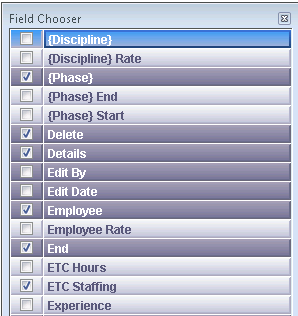
grid opens the Field Chooser dialog box,
shown below. Select the checkbox for a field to add it to the data grid.
Deselect the checkbox to hide a field.

Data Grouping
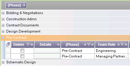
In many tabs, data rows can be grouped. Simply use the mouse to drag the column or columns you wish to group by into the area titled Drag a column header here to group by that column. Grouping often results in group summary values for various columns, as shown below. The groups can be expanded using the + sign to the left of the grouped row to reveal the underlying detailed data rows. To remove a grouping, drag the column from the grouping area back to the main data grid.

Sort | Multi-Select Filtering | Column Pinning
The icons at the top of each column allow for control of what data appears in the grid and in what order. Following are explanations of each of the column header options:
Sort
By default, rows appear in the order they were created. To sort the rows by any column, click on the column header. An upward pointing arrow to the right of the column name indicates that the column is sorted in ascending order (A-Z); a downward pointing arrow indicates that the column is sorted in descending order (Z-A). Clicking on a column header will toggle the display order. Holding theshiftkey while selecting multiple columns will allow for sorting of multiple columns (i.e.,PhasethenTeam Role). No arrow indicates that the column has not been sorted.
Multi-Select Filtering
Many columns include the ![]() icon, indicating that the
contents of the grid can be filtered based on the column values. Click
the icon to access the Filtering popup,
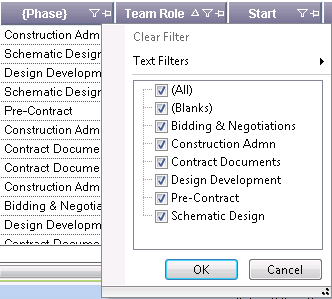
shown here:
icon, indicating that the
contents of the grid can be filtered based on the column values. Click
the icon to access the Filtering popup,
shown here:

The Filtering popup provides Microsoft Excel-like multi-select capabilities, allowing users to quickly select the items they want to view without having to create a custom filter. Select the checkbox for any values to view in the data grid. Clear the checkbox for any values to exclude from the data grid. For example, you could use the multi-select filtering to view only certain phases on the Team tab.
To create a more detailed, custom filter, select an option from the Text Filters/Number Filters/Date Filters menu at the top of the Filtering popup to access the Custom Filter dialog box.
The filter icon turns blue to indicate that a filter has been applied to the column. To clear the filter, click the icon and select Clear Filter.
Column Pinning
Often, the data grids are wider than the screen space available. If
there is a column that you always want visible, you can pin it in place
so that it remains visible during horizontal scrolling. Click the ![]() to pin the column in place. The column is automatically moved as far left
in the grid as possible, and the pin icon points down to indicate that
the column is pinned in place. Click the pin icon again to unpin the column.
to pin the column in place. The column is automatically moved as far left
in the grid as possible, and the pin icon points down to indicate that
the column is pinned in place. Click the pin icon again to unpin the column.
Summaries
The row along the bottom of the grid is used to display the summations of row values. These summary calculations are pre-built into Project Analyzer.